Messaging was the first feature we implemented into SI. The feature itself stood the test of time well, and we’re quite proud that modern companies such as Buffer are using a feature that we designed and implemented over 4 years ago. But the user interface was starting to look dated, so we’ve just rolled out several improvements to the stream:
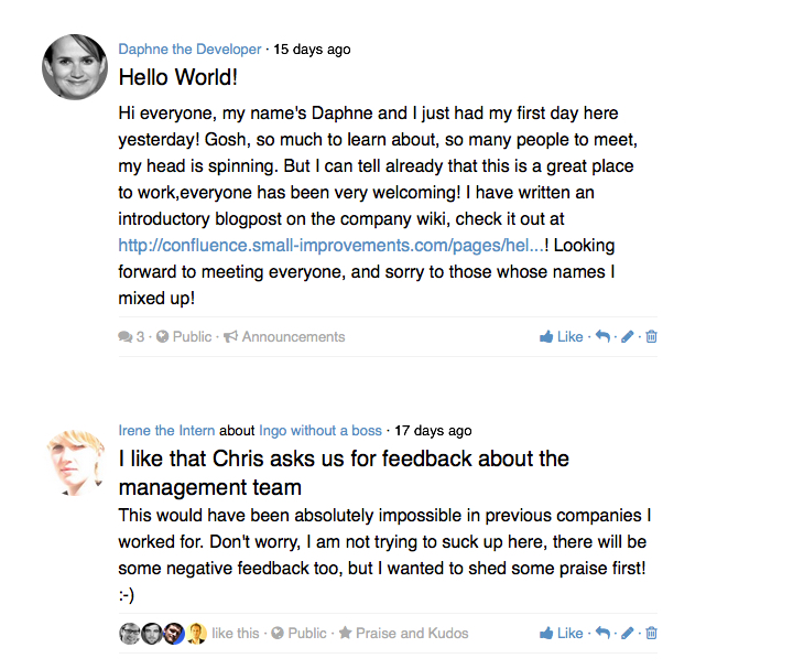
We’ve streamlined the User Interface
We’ve moved the author and recipient to the top of the message,t he upvotes from the far right underneath the message, and the action-buttons are now always visible (no need to hover). The message width was slightly reduced, while the font size was slightly increased, meaning that messages are more readable now. Here’s what it looks like now:
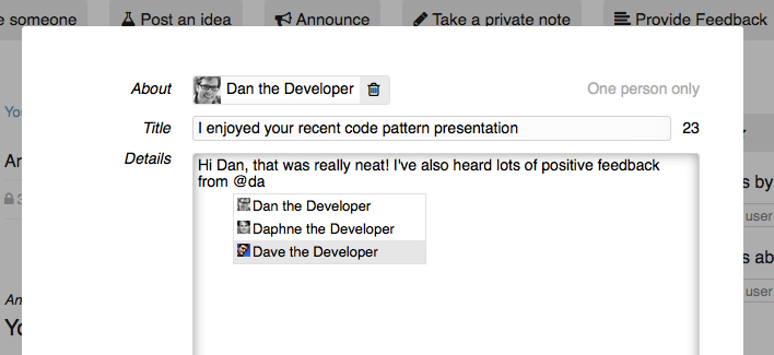
You can now @mention users!
This improvement is very neat: By default only very few people get notified immediately by mail when a message is created: The recipient of a message, and the people who a message is restricted to (if any). But by mentioning a person (using the ‘@name’ format you can trigger a notification to that person as well, which is a very handy feature:
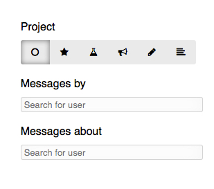
We’ve added a simple filter option on the right
Thanks to the slimmer message display, we can now use the right hand side for a new filter option. You can now limit display to certain kinds of messages (only praise, or only announcements for instance), or you can display only messages by or about a person. You can combine these filters, showing only messages by person A about person B in a certain context.
We’ve dropped downvotes
Downvotes were rarely used by our clients. Downvotes can be great to quickly identify illegal or inappropriate content on platforms like YouTube or Reddit, but ultimately SI is a closed environment and the need for downvotes is minimal. So we removed the button from the UI. Existing downvotes are still being displayed, but no new ones can be added.
There’s now only one upvote per person, and it’s rebranded into “like”.
Just like Facebook, enough said. Or well, let’s elaborate just a bit: The original intent was to allow multi-upvotes to signal very stong agreement. However, it’s just very uncommon and many people got confused. It’s really not worth the confusion of many people to make a small minority happier, so one like per person it is now.
We’ve implemented endless scrolling
It’s hard to brag about this, because having to click “load more messages” was annoying in 2011 already. “Fixed at last” is probably the best way to describe this improvement 🙂
What’s next?
This overhaul was long overdue, and it improves the feature a lot. Still, some common feature suggestions are not covered yet. Favorite suggestions like “ability to praise multiple people”, “improved email notifications”, “better display on user profiles and on the dashboard” are still on our roadmap. So this was just the first steps in many.
We’re currently busy overhauling the objectives feature, and the improved messaging UI will make commenting objectives a breeze. We’ll work on vastly improved user profiles and dashboards soon, the messages will be tightly integrated on those of course. We are considering to allow commenting on reviews, so multiple stakeholders in addition to the actual reviewer can discuss a review in writing. We will definitely implement “multi-praises” and better emails at some point, but it’s too early to talk about an ETA for either of these yet.
Let us know what you think!
Now that the new messages UI is live, what do you think? Do you have feedback or suggestions for improvement? We’d love to hear! Simply send us a mail to support@small-improvements.com, we’ll route this to the designers and developers of the improved stream.